
This Mobile SEO 2024 guide aims to provide you with easy-to-follow information on mobile optimization and common mobile SEO mistakes that you must avoid making in 2024.
According to Google Internal Data, “More google searches take place on mobile devices than on computers in 10 countries including the US and Japan.”
Now, people use their smartphones more than desktops to find the things they are in the search of, meaning your website needs to be optimized for mobile devices if you want to get found in a mobile search.
How can you ensure that your website is optimized for mobile devices?
Well, this is what I am going to explain in this post.
As this is a mammoth post, I have added links to different sections for easy navigation.
Table of Contents
1- What is mobile optimization?
2- How Mobile SEO Is Different Than Desktop SEO
3- Why You Can’t Ignore Mobile SEO
4- What Is Mobile-First Index?
5- Tools to Analyze a Website for Mobile Search
6- Get Mobile SEO Right: Easy Steps
6.1- Optimizing Content for Mobile
6.2- Mobile Optimization for Technical Aspects
6.3- Mobile Optimization for User Experience
7- Common Mistake in Mobile SEO
8- Conclusion
What is Mobile Optimization?
If you are thinking mobile optimization is making a website mobile-friendly, you are wrong.
A mobile-friendly website will shrink its pages to be viewable on mobile devices, while mobile optimization is the process to offer visitors a seamless experience optimized for mobile devices.
Mobile optimization considers content, site design, site structure, page speed, and more to ensure that visitors can effortlessly accomplish what they want to do on any mobile device.
How Mobile SEO Is Different Than Desktop SEO
With mobile-first indexing, most new websites now display the same content to both users and search engines on both mobile and desktop devices! Still Mobile SEO and desktop SEO are two different, separate entities.
What makes mobile SEO different from desktop SEO?
Here is a list:
- Mobile often uses different search behavior as not all mobile users search with keywords
- Mobile has different level of engagement- mobile users are highly-focused, but they are less interested in scrolling down as compared to desktop users
- Mobile looks at different quality signals to rank a website
- Mobile search uses a different ranking algorithm that often changes search results on a mobile phone due to location factor
There are many other differences between Mobile SEO and desktop SEO.
So if you are not considering differences and traditionally optimizing your website, you are not doing Mobile SEO.
Why You Can’t Ignore Mobile SEO
More people, as previously mentioned, are now using mobile phones than desktops to search their queries. And the number of mobile phones is growing exponentially.
According to Statista, there are around 6,841 million smartphone users worldwide now. And the number is expected to reach 7,690 million till 2027. With such a large user base, you cannot ignore mobile SEO. Can you?
Google itself has been trying hard to encourage web developers to build mobile-friendly websites. On April 2015, Google released Mobilegeddon, the Google mobile-friendly update designed to boost the ranking of mobile-friendly pages in mobile search results.
Since Mobilegeddon, Google has made a tremendous progress. Now, it is going to roll out mobile-first index.
What Is Mobile-First Index?
Though a large number of people is using mobile phones to search, Google still looks at the desktop version of the site to evaluate its relevance.
To make results more useful and in line with the fact that more people access to mobile devices to search, Google has begun experimenting mobile-first index.
However, it does not mean Google will have two indexes of a website.
Google says,
“Although our search index will continue to be a single index of websites and apps, our algorithms will eventually primarily use the mobile version of a site’s content to rank pages from that site, to understand structured data, and to show snippets from those pages in our results.”
Here is what Google recommends to get ready for mobile-first indexing:
- Those having dynamic serving websites and responsive sites with equivalent markup and primary content across desktop and mobile won’t have to change anything
- Businesses having only verified desktop website in search console should add and verify mobile version in search console
- Business with different primary content and markup across mobile and desktop websites should make some changes, such as serving structured markup for both desktop and mobile version and verifying that mobile version is accessible to Googlebot
Tools to Analyze a Website for Mobile Search
You reckon that mobile SEO is important.
Great!
It is the right thing to optimize your website for mobile search. But before that, you need to know how to analyze a website to know if a website is ready for mobile search.
Thankfully, there are many tools that come handy in the process to examine a site for mobile search. I will explain three of my favorites:
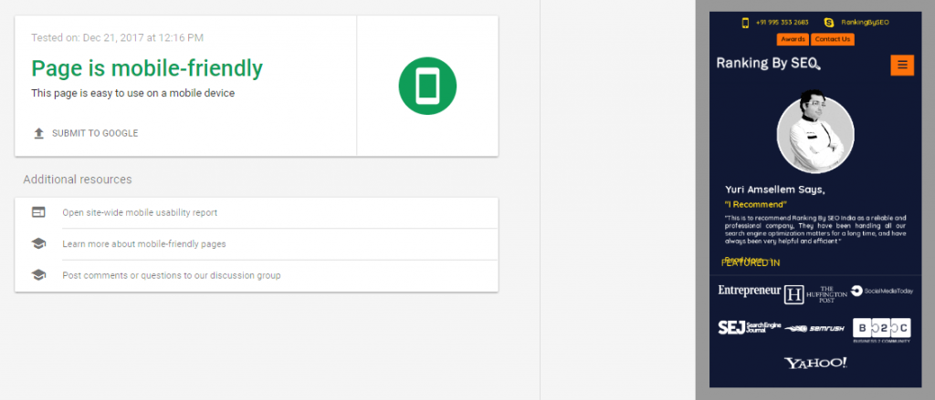
1- Google’s Mobile-Friendly Test
As the term suggests, Google’s Mobile-Friendly Test can help you know how a visitor can see your website pages on a mobile device.
2- Google’s PageSpeed Insights
This is very helpful for mobile SEO. PageSpeed Insights checks the performance of a page for mobile and desktop devices. To provide data, PageSpeed Insights fetches the URL twice – once with a desktop user-agent and once with mobile user-agent.
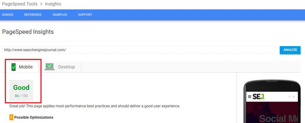
PageSpeed Insights provides a score based on common performance best practices and offers a score, ranging from 0 to 100 points.
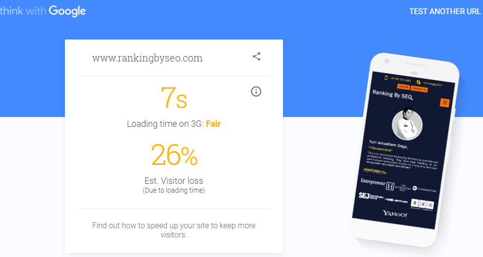
3- Test Mobile Speed
It is a more advanced tool than Google’s PageSpeed Insights. It is more visually appealing and easy-to-use.

What’s more, this tool offers a comprehensive report that you can get in your mail.
This tool from Google is probably the only tool you need to analyze your website for mobile optimization.
The best thing about it is its detailed report that will provide you with comprehensive suggestions on optimizing your website for mobile.
Get Mobile SEO Right: Easy Steps
So you have analyzed your website and found that your website needs to be optimized for mobile.
The next, I will discuss the step-by-step process to get mobile SEO right in 2024:
Optimizing Content for Mobile

There is a popular saying about content propelled first by Bill Gates.
Content is King! This is true for mobile optimization as well.
My friend, if you want to get the top ranking in mobile-first indexing, you should closely watch the content of your website and ensure that the content is optimized for mobile devices.
Here is how you can do it.
Word Count
When it comes to word count, you need to understand that it is quite tiresome to read long articles on mobile devices, especially on smartphones.
However, people read a lot on mobile devices. So you need to ensure they have a good reading experience.
Keeping content between 700 and 1000 words is plenty for mobile devices.
Keywords and Related Phrases
Including keywords and related phrases in content supports desktop SEO.
Does it support mobile SEO?
The answer is yes. However, you should try to avoid over-optimizing your content for mobile devices.
Needless to say, Google is going to make meta descriptions and meta titles short for mobile sites. So it is advisable that you should not write long Meta descriptions and titles. Else, they will be truncated by Google.
Also, you should not forget the fact that more than 20% of mobile queries are voice search now. This means you should optimize your content keeping voice search in the mind.
According to research, 22% voice queries are pertinent to local information, indicating that you should include natural key phrases that people often use to find local information in your niche.
Also, you should not use those keywords in external links on which you want to rank. Reason?
Google might interpret that important information is available on pages that you link externally through the keywords.
Structured Data to Mobile Site
As mobile devices have limited screen space, search results with rich snippets have a potential to stand out.

The first search result has a rating, reviews, and price range while the second result does not show a rich result.
Don’t you think viewers will click the first search result first? Yes, certainly they will.
You can add a rating, reviews, and price range with the help of Schema.org structured data.
What is Schema.org structured data and how can you add it to your website?
According to Schema.org,
“Schema.org is a joint effort, in the spirit of sitemaps.org, to improve the web by creating a structured data markup schema supported by major search engines. On-page markup helps search engines understand the information on web pages and provide richer search results.”
You can use Schema.org structure data to markup all kinds of items from products to person to place.
Here is a full list of items that you can markup with Schema.org structured data.
Though we don’t have conclusive data to conclude that structured data improves ranking in search results, rich web pages (those created with Schema.org) have better click-through rates (CTR) on mobile devices.
Mobile Optimization for Technical Aspects
There are various aspects of technical mobile SEO that you should take into consideration to optimize your website for mobile search.
Here are five important factors that influencer mobile ranking:
Site Speed
It is obvious that users show less patience when they are surfing on mobile devices.
According to a report published on Think with Google blog,
“The average U.S. retail mobile site loaded in 6.9 seconds in July 2016, but, according to the most recent data, 40% of consumers will leave a page that takes longer than three seconds to load.”
What is more,
It is official now page speed will be a ranking factor in mobile-first indexing. This simply means Google will give preferences to fast pages.
My friend, you cannot afford to have slow loading pages.
How can you boost site speed?
Followings are a few proven ways to increase the site speed of your pages:
- Measure and minimize server response time
- Minimize redirects
- Optimize and minify CSS and JS files
- Use compression to reduce file sizes
- Put CSS at the top and JS at the bottom of HTML files
Flash
If you are using Flash content on your website, it can affect the performance of your website in mobile search. Why?
Most browsers don’t support Flash content at present and they cannot display it. This is the reason why you should avoid using Flash content on your mobile website.
The search engine giant itself is against it.
Google says, “Avoid common mistakes that frustrate mobile visitors, such as featuring unplayable videos (e.g., Flash video as the page’s significant content). Mobile pages that provide a poor searcher experience can be demoted in rankings or displayed with a warning in mobile search results.”
Accelerated Mobile Pages
In the recent few months, there has been lots of buzz about accelerated mobile pages.
What is it?
Accelerated Mobile Pages (AMP) project is an open resource that is designed to offer better web experience across all devices. With the help of AMP websites , you can create beautiful, fast, high-performing ads and websites across platforms and devices.
Will AMP help you with mobile SEO?
The answer is Yes.
As accelerated mobile pages have light CSS and HTML code, they load 30 times faster than regular pages. This boosts mobile ranking and click-through rates.
AMP offers the best user experience. This is why big brands like The Washington Post uses it.
Technical Errors
Your mobile website should be free from any technical error. Faulty redirects, 404 errors, duplicate content, faulty navigation, etc. affect mobile ranking.
Small technical problems can cause big problems if you don’t fix them quickly.
Mobile Optimization for User Experience
User experience and mobile SEO go hand-in-hand. The time when people are using more smartphones than their desktops to search on Google, offering great user-experience benefits mobile SEO.
Following is a list of some quick ways to offer awesome user experience on mobile phones:
Design
There are three ways to implement a mobile website.
Here is the Google’s chart comparing the three:
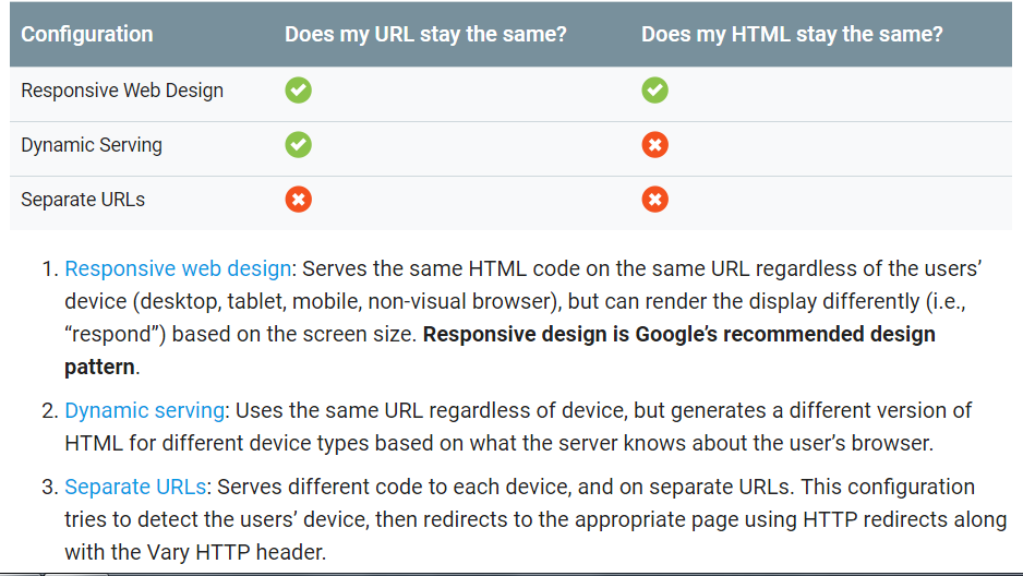
Choose the method that suits you.
Images
Image optimization is a bit tricky because you have to make a fine balance between page performance, user experience, and attractiveness.
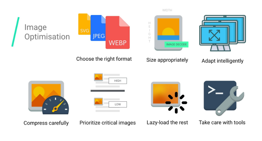
Here is what Google suggests for image optimization:
How many images should you use per page?
Well, it depends. On average, a single mobile page has 4 images.
Remember, too many images affect page speed.
You can read Google’s Guide to Image Optimization here.
Typography
As I mentioned earlier, reading longs texts on small screens of mobile phones is a bit stressful for eyes. Therefore, you should use easy-to-read typography.
Here are a few tips about typography that will help with mobile SEO:
- Use at least the font of 14 pixels
- You should use font color based on the theme of your website
- Add enough whitespace between headings and paragraphs
- Use distinct color for links
- A line should not have more than 65 characters
Keeping these points in the mind improves user experience and eventually will help with mobile SEO in 2024.
Touch Elements
Does your website have interactive elements, such as buttons, surveys quizzes or checkboxes?
If yes, you should never use small touch elements as small touch elements often hinder user experience when people are accessing a website on their mobile devices.
Imagine the frustration you will feel if you are missing small touch elements again and again or clicking on the wrong elements due to their small sizes.
Small touch elements can reduce conversion rate, as users might not be able to click the right button in the first go owing to its small size.
Large touch elements optimized for mobile website boost conversions.
As rightly pointed out by Neil Patel on Crazy Egg,
“You need to get your users to become more actively involved with your content and website. Why? Because passive lurkers don’t convert! The way to boost your conversions is to boost your interactivity.”
Small touch elements are bad for mobile SEO in 2024.
Intrusive Interstitials
Be it a mobile device or a smartphone, people don’t like pop-ups. People even dislike a pop-up that cutely asks for a subscription to a website.
Imagine you are searching a website on your smartphone, and a pop-up appears repeatedly covering the entire screen of your phone.
Won’t you be annoyed? Of course, you will. Nobody likes to close a pop-up window again and again.
Google also doesn’t like pop-ups. The search engine giant says on its blog,
“Pages that show intrusive interstitials provide a poorer experience to users than other pages where content is immediately accessible. This can be problematic on mobile devices where screens are often smaller.”
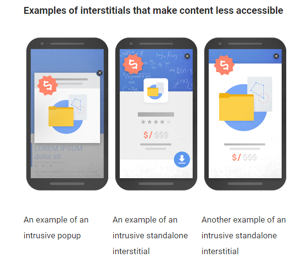
These interstitials hamper user experience so they are bad for mobile SEO.
However, interstitials that appear in response to age verification, login dialogs won’t affect the ranking on mobile devices.
Internal Links
Needless to say, you should have a few internal links on mobile pages due to the limitations of space.
Also, you should not place two links together as users might click the wrong link on the small screens of mobile devices. This might affect the conversion rate of your mobile site.
So be careful with internal links on your website.
Voice Search Optimization
As mentioned earlier, a significant number of people is using voice search to find the information they are looking for. This means you need to optimize your content for voice search to improve user experience on your mobile site.
Here are a few ways to optimize for voice search:
- Think how people speak – this will help you choose keywords based on natural conversation
- People often ask questions through voice search – include question phrases in your content
- Emphasize semantics
- People often voice search to find local things – optimize your local listing
The topic mobile SEO in 2024 cannot be complete without talking about voice search optimization for OK Google, Siri, and Amazon Alexa.
For detailed information about voice search optimization, read our step-by-step guide to voice search optimization.
Common Mistakes in Mobile SEO
Thanks for reading so far. I have explained the best strategies that will certainly improve your mobile SEO in 2024.
The next, I will talk about common mobile SEO mistakes that you must avoid to improve conversions.
Without further ado, let’s us dive in:
1- Treating Mobile an Extension of Desktop
Some businesses treat mobile an extension of desktop despite the fact that mobile search has grown bigger than desktop search. They use illegible fonts, pop-up ads, not enough spacing and white space on pages. These things adversely affect user experience and directly impact mobile ranking and conversions.
2- Not Properly Implementing Mobile Site
If you choose to have a separate URL for mobile devices, you should not neglect to use any form of device detection of URL canonization. Failing to do so might lead to URL duplication in the SERPS affecting site’s ability to grow. You should properly implement mobile site according to Google’s guidelines.
3- Getting Mobile but Implementing Desktop Strategies
Sometimes, it happens that some businesses implement mobile site but are not able to adopt mobile site completely. They keep using the same click-bait strategy (created for a desktop site) with a mobile site. You should avoid it.
Mobile-first means you need to think about mobile first in every strategy. Only then, your mobile SEO in 2024 bring good results.
Conclusion:
With the advent of mobile-first indexing, mobile SEO had become something that businesses can’t afford to ignore.
When you are optimizing a website for mobile, you should keep users in the mind. Mobile SEO is all about user experience.
Optimizing content for mobile devices, taking care of technical mobile SEO (site speed, flash, AMP, technical errors), and optimizing a mobile site for awesome user experience are surefire ways to optimize a site for mobile devices and boost conversions.
Also, you should avoid making common mobile SEO mistakes that can kill mobile ranking and conversions.
What about you? Do you want to share any secret tip for mobile SEO in 2024? Do share it in the comment section. I’d love to know about it.
Google measures user experience on both, and adjust the search results accordingly. A major factor for mobile is load time.
Thanks Alok for reading the post and sharing your thought. I agree that site speed is an important factor for mobile SEO. What is your take on voice search and mobile SEO?
Lalit, thanks for the article. 2018 will be a thrilling year for SEO. You didn’t mention backlinks as part of your strategy. Don’t you think that quality links are still relevant for ranking?
Hey, backlinks are not going anywhere, at least not in 2018 I believe. It is obvious that they are still relevant. That’s why I didn’t mention. Thanks for bringing it forward. In 2018, the link building strategy should be focused more on earning backlinks than building links.
Thanks for the article you have shared about 2018 seo aims. It was good to know more about how can I improve the website accordingly.
I’m glad you find it useful!
Interesting Article on Mobile SEO in 2018.
You explain well and I notice Some important Points you have given in this Article like Analyze a Website for Mobile Search or Common Mistakes in Mobile SEO.
Thanks for the article.
Thanks, Johnson. I’m happy that you liked it.
Hi Lalit,
Thanks for sharing a useful blog on mobile optimization. Since it is a new emerging trend that is being used these days for websites. Because more and more users are using mobile for searches. According to analytics report. from jan 2016 mobile users have increased to 3 times from jan 2016 to jan 2018.
Can u please explain what are the ways to make website pages AMP friendly?
Please guide!
Thanks in advance!!
Thanks, Neeraj. I’m glad you liked the post. We will produce a guide on AMP soon. Keep tabs on!
A perfect guide, making your mobile site always ready for google search is important. Structured data is one of the key thing which will help google to crawl your site content.
Thanks for nice words!
Extremely useful post. Its in buzz that google is focusing more on mobile search results so everyone have to make their website mobile friendly, as fast and accessible as possible and solidly structured.
Thanks, Zubida. With Mobile First Index already working, Mobile SEO has become imperative for all.
Great Blog about Mobile SEO Lalit, it’s an interesting article because of the several important factors about the SEO that you have mentioned in your blog.
Thanks, Jitudan, I’m glad you liked our post. Please subscribe to our blog to stay tuned.
Really, this is the real analysis of Mobile SEO I have ever found.
Each and every point is genuine, well written and very well analyzed. Thanks for sharing the information with us.
Thanks for nice words!
Very very informative post for a blogger or a website owner like me. I really appreciate your post. Thanks a lot for publishing such a post. I also request you to publish such post so that I we can be benefited with it.
Great Blog for those people who want know about mobile SEO.
Often, this process can highlight low-quality pages on a site.
Thank you so much @Lalit Sharma for your important article about mobile SEO. can you write another article about ranking factor?
Hi Joseph
Glad to know that you found it good for you. You should see a post on most important ranking factors soon.
Nice Post, You are Awesome
Well well well, the AMP part is now on my head. My site is already on AMP from the time AMP came to market. Now should I go back to non AMP ( which I know will have a negative impact) or better to stick with it?
Hi Navdeep,
As long as your AMP is implemented correctly, and you have done proper SEO accordingly, you have no problem.
Such a nice information for mobile SEO thanks.
i am also using AMP for my site but according to some research, AMP pages decreases conversion by 59 percent. So, do you think it is good specially for E-commerce website?
Hi Sandip,
Yes, you are correct about drop in conversions for eCommerce websites. However, it’s good for informative websites such as news. You should focus on other possible ways to optimize your website than AMP.
hello.
mobile seo guide useful guide. i like and share this post. thanks for sharing…
cheers.
Very informative indeed!!! Thanks for sharing your knowledge. Great work Lalit! Keep posting such researched blogs.
Regards,
Anuj
Thank you for sharing this awesome guide on mobile SEO. Nowadays, the mobile visitor is more than a desktop visitor. That’s why we need to optimize mobile-friendly blogs to get more visitors. Just got a question in mind, how did you optimize image size for mobile visibility?
Really amazing post for mobile seo. Keep sharing the good content.